カルド溝の口
CALDO Mizonokuchi
YOGA Studio
Mizonokuchi, Kanagawa/2014.9
OVERVIEW
-
- READ OVERVIEW
-
-
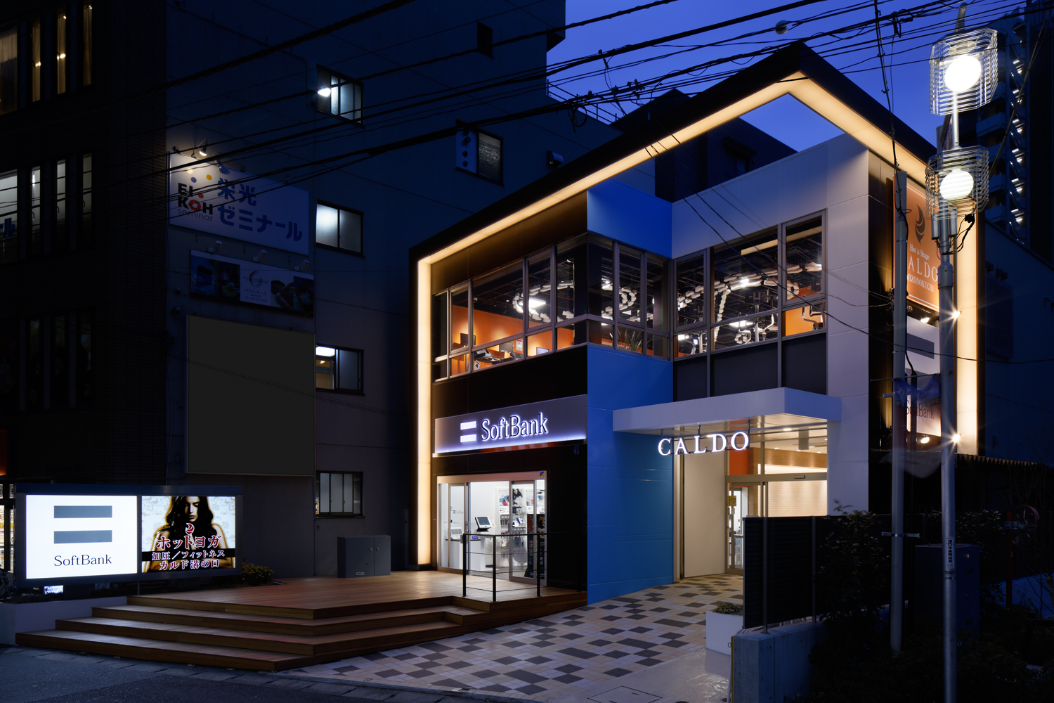
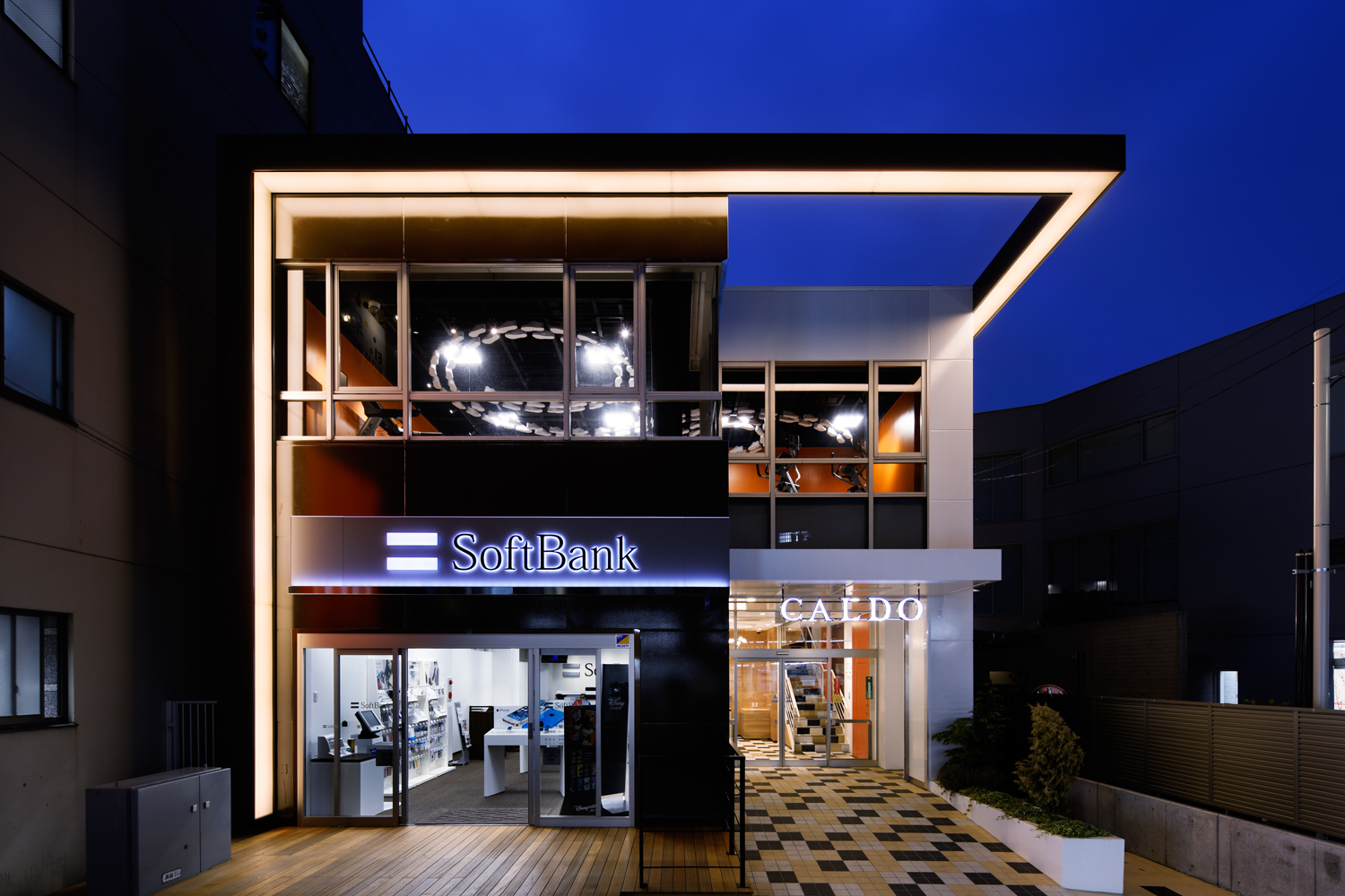
カルド(CALDO)はホットヨガをメインプログラムに、フィットネスやピラティス、加圧トレーニングなどが手軽にできる施設として全国展開しています。
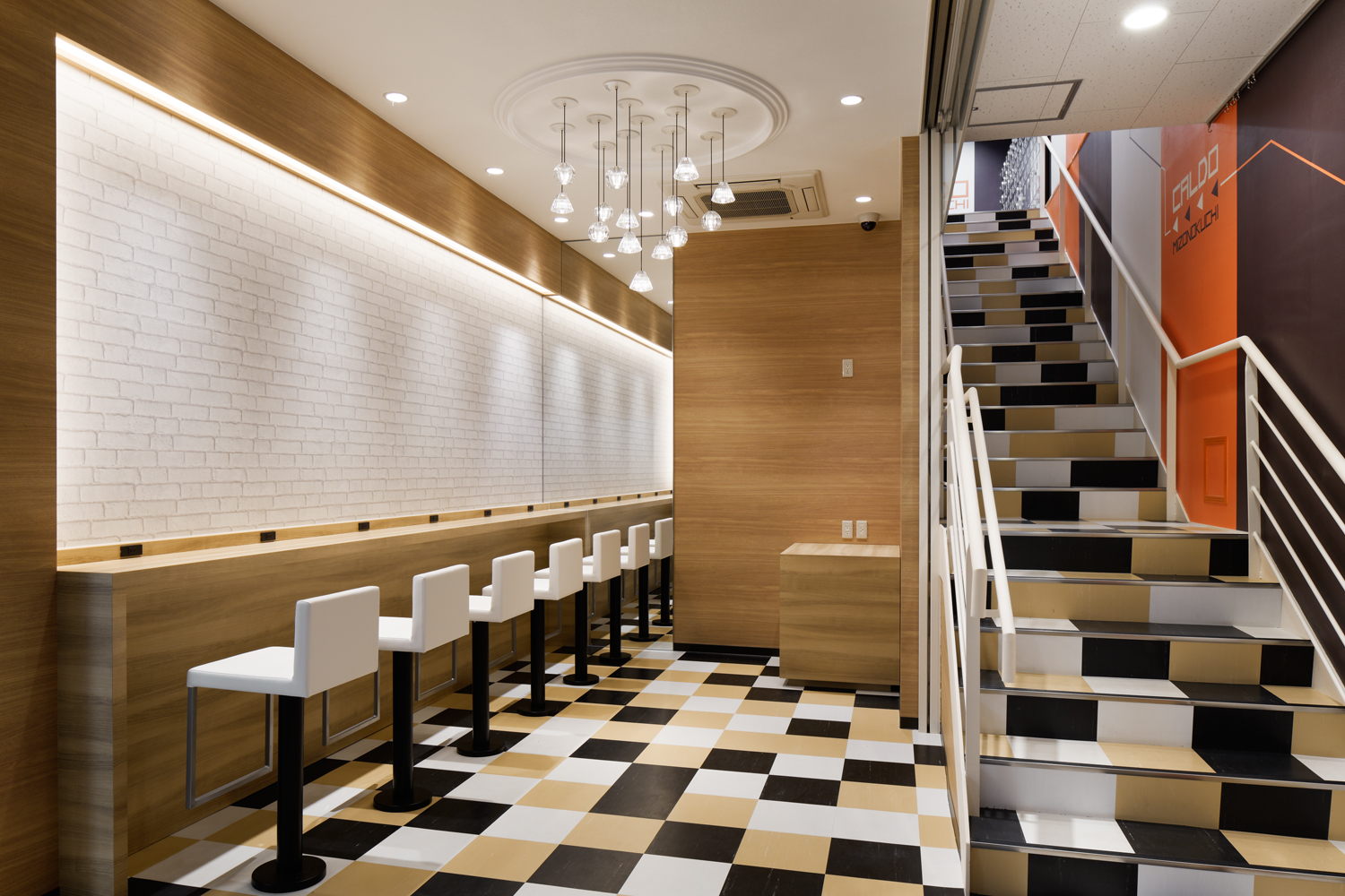
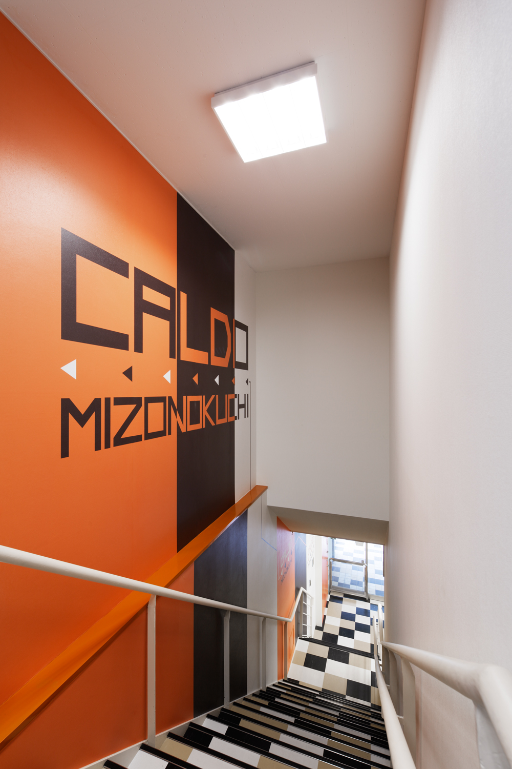
プログラムには”静”と”動”が混在するため、個々の空間やそれぞれの関係性をどのようにデザインするか。この課題に対し私達は、その場所を利用する際に、心理的に想起される【色】を主軸として、発想を展開することとしました。
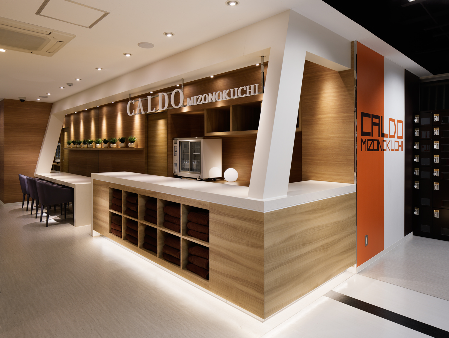
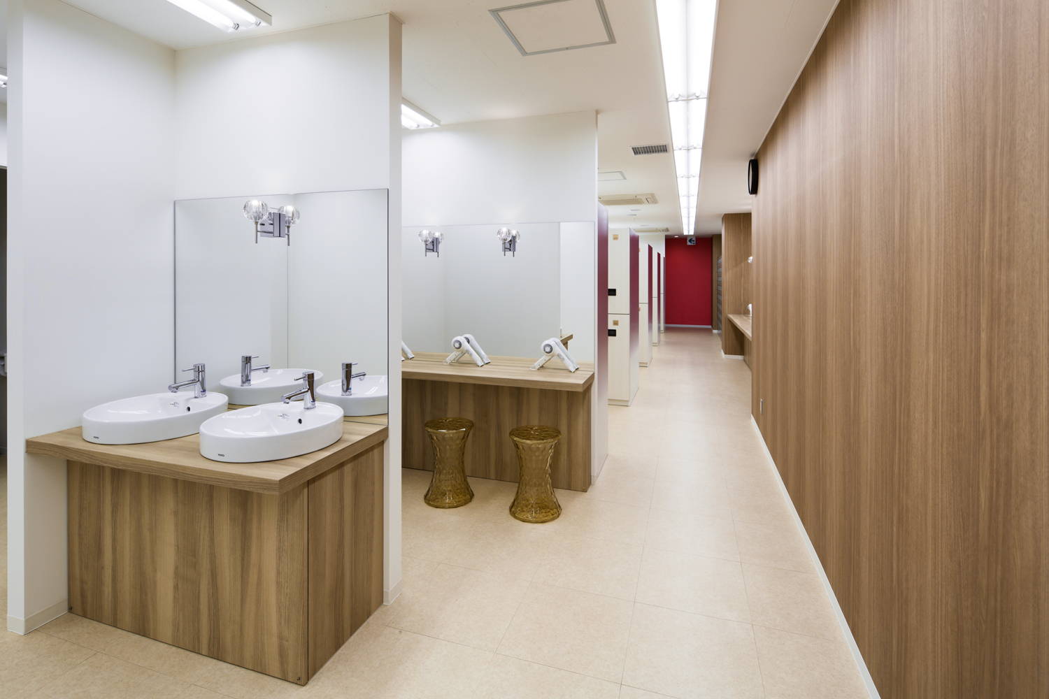
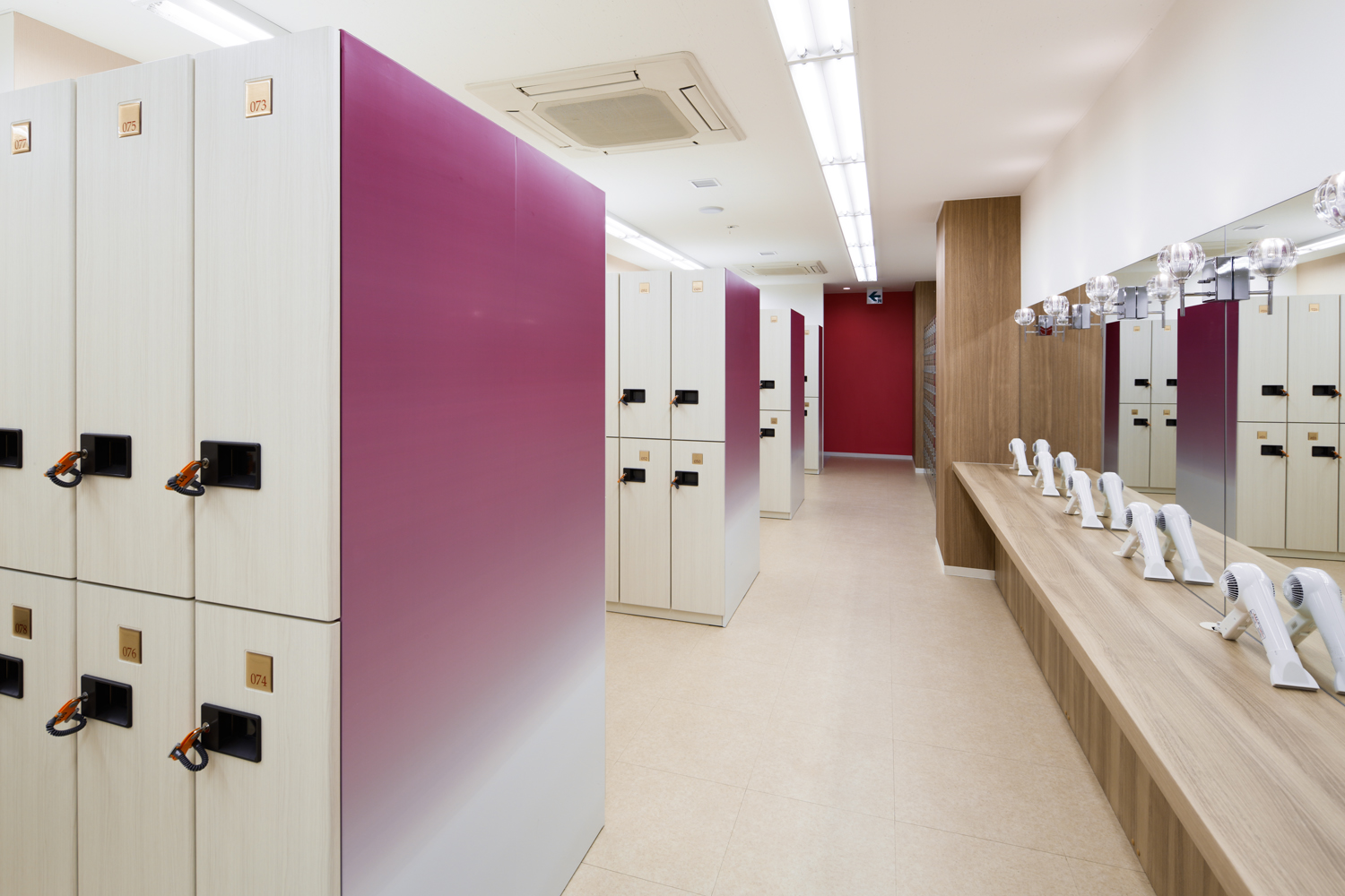
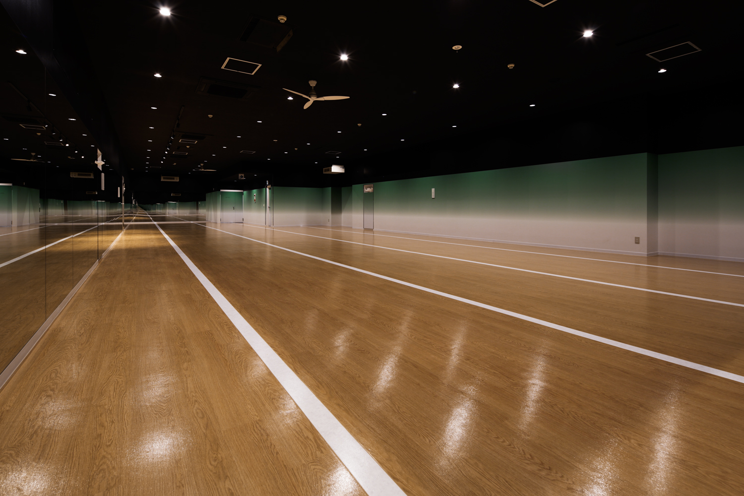
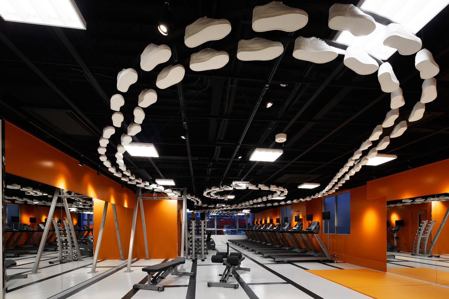
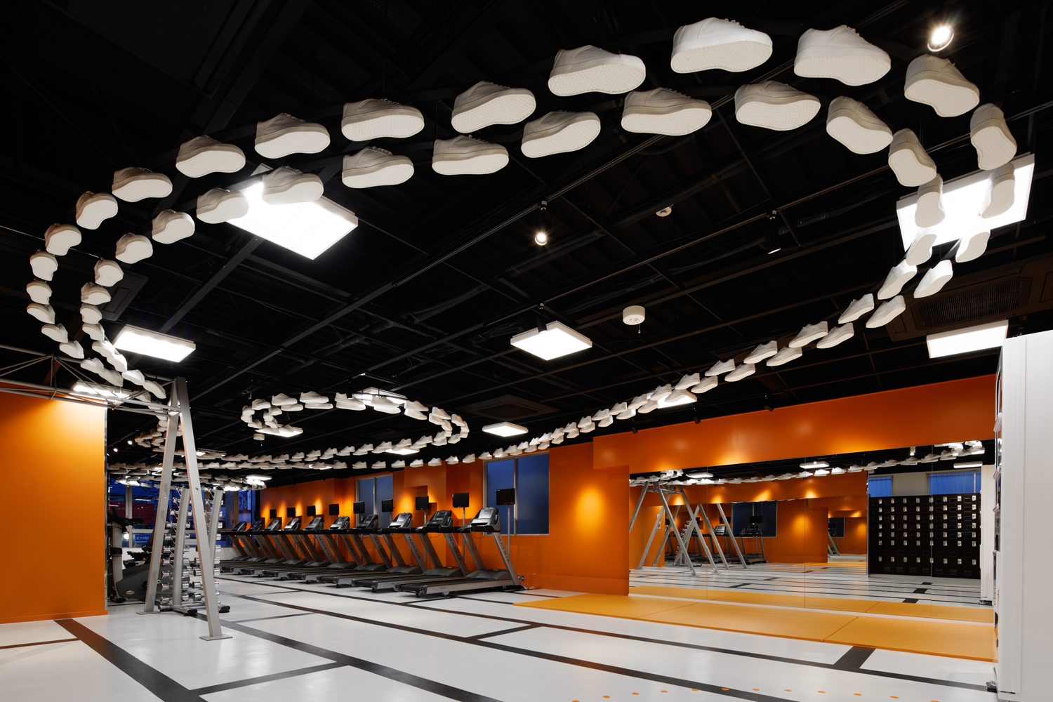
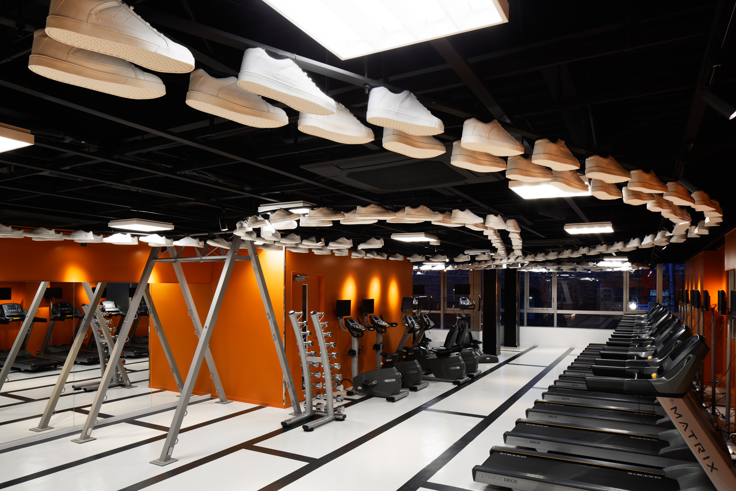
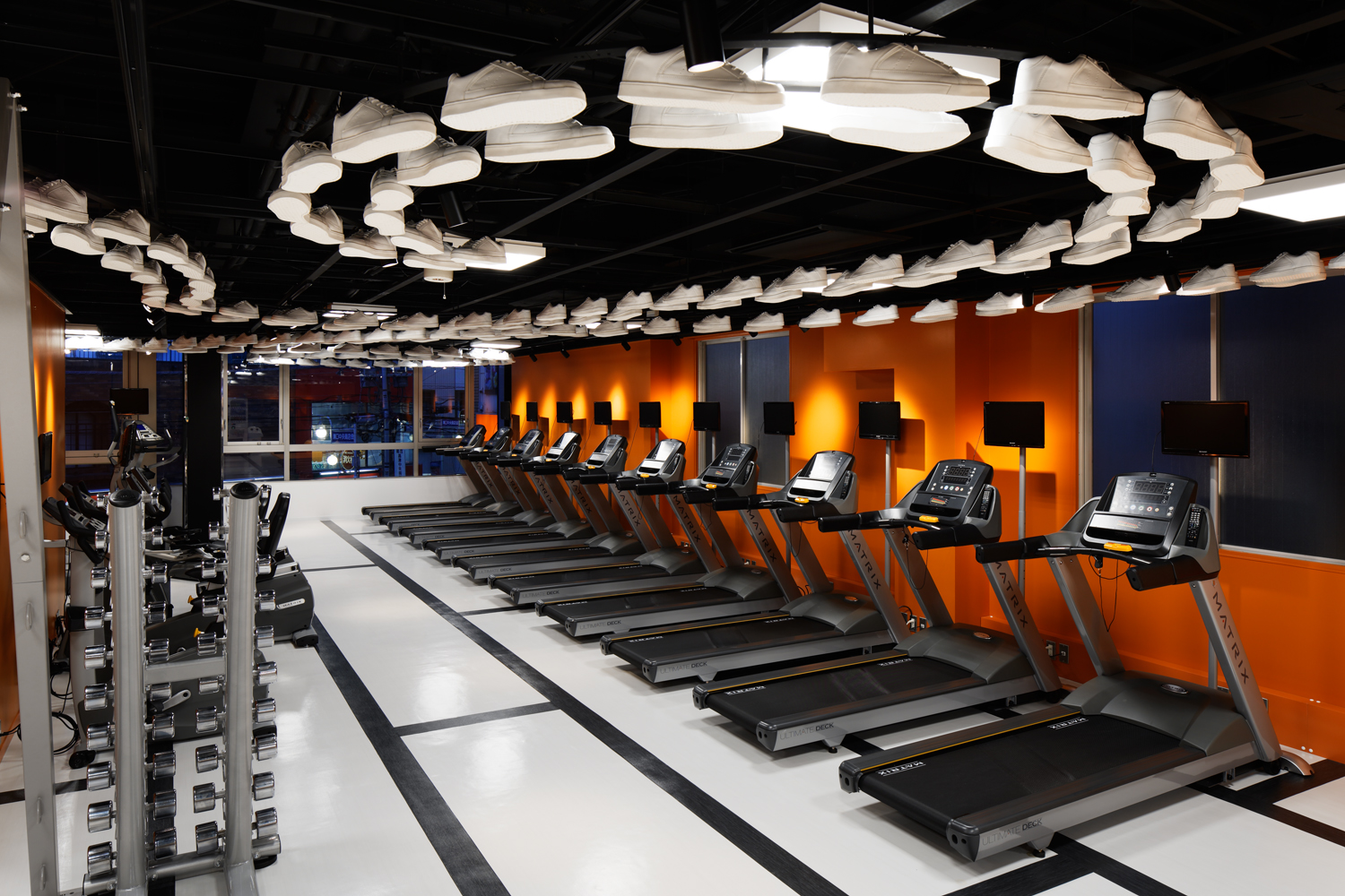
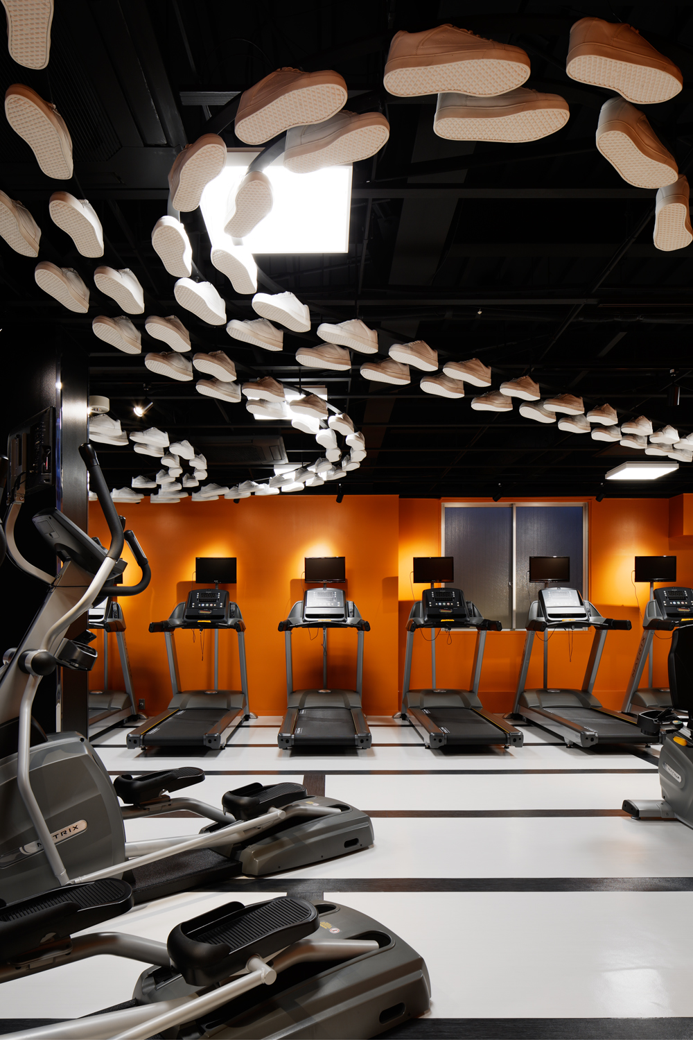
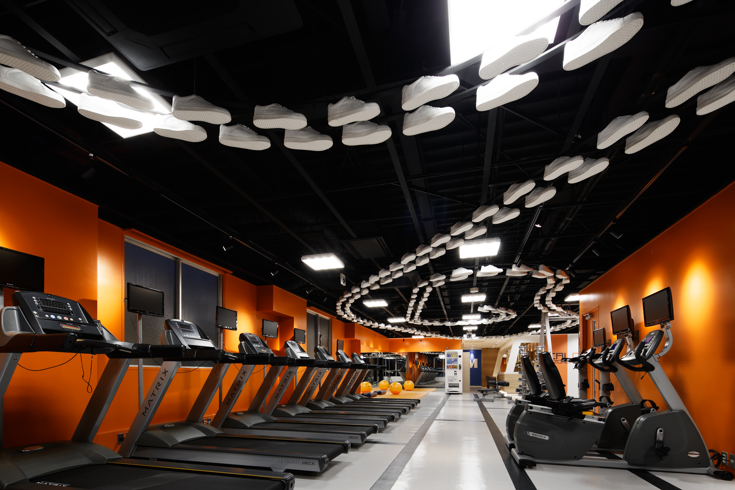
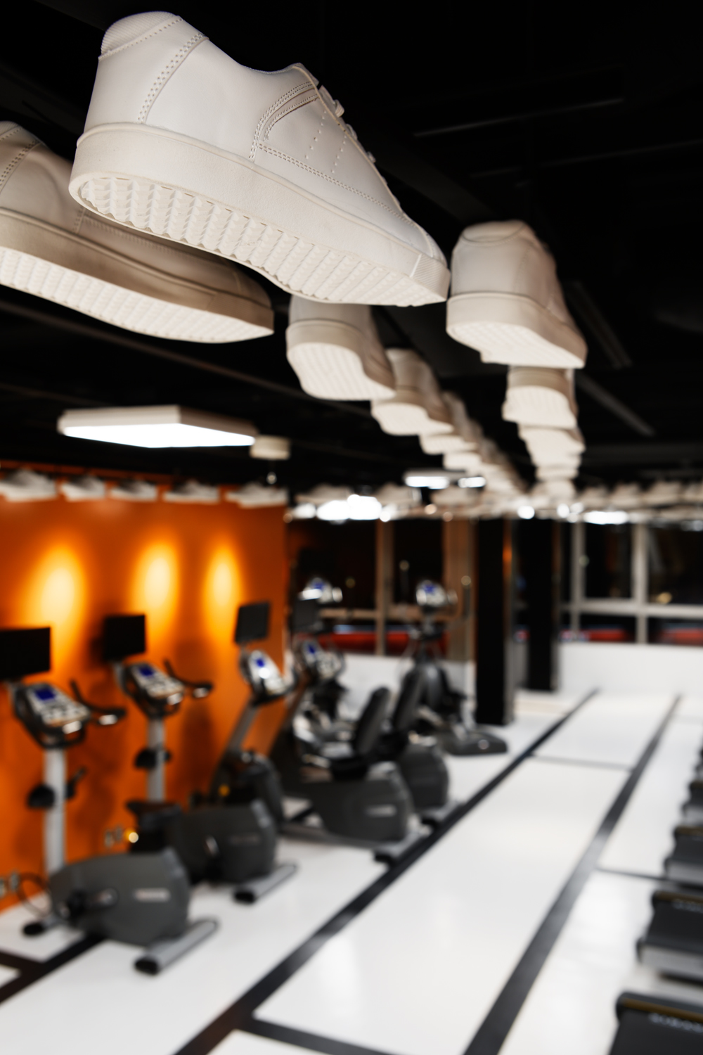
まず、フロント廻りやロッカーは特徴的な空間の緩衝帯となるエリアのため、機能として必要な清潔感を意識しつつ、気持ちが落ち着く【紫色】と木目の柔らかい印象を利用し整えました。そこからホットヨガスタジオに移ると”静”のエリアなのですが、ここでは集中と解放、現実と非現実、を行き来する心理的な面を意識し、【緑色】や【無彩色】などの中性色を使って、幻想的とも捉えられる空間創出を目指しました。さらに、”動”のエリアとしてのジムは、暖色の【橙色】を利用するとともに、天井に300足を超えるスニーカーを配すことで、無機質で固い印象になりがちなところを、有機的で躍動感のある空間となるよう注力しました。
このように【色】を多用すると、ときに子供っぽさやポップさが前面に出てしまいますが、ポイント使いしたりグラデーションにしたり無彩色と組み合わせたりすることで抑揚を与え、またファサードを店内より1トーン落ち着いた色味にしつつ、シャープに整えることで、全体のグレード感を引き上げ、洗練された施設としてまとめることができました。(井上愛之/ドイルコレクション)
CALDO is a national chain fitness facility where customers casually enjoy Hot Yoga, Fitness, Pilates and Pressurizing Training.
There are mixtures of "stillness" and "motion" in the programs. One of our challenges was how to design the individual space with the surrounding relations. As principle axis, we decided to use "COLORS" that will associate psychologically when customers enter the facility.
Firstly, around the front desk and locker areas will become a characteristic buffer zone. We were aware of making this place with a sense of cleanliness. Using PURPLE color, we created comfort along with wooden tone which will bring warm expression. Stepping into the Hot Yoga Studio, there lies the "stillness" area. We chose neutral colors such as GREEN and ACHROMATIC colors to create magical atmosphere to switch the psychological aspects of "concentration" vs "openness" and "reality" vs "unreality". Secondly, for the "motion" area in the gym, we selected warm color ORANGE with over 300 pairs of sneakers displaying on the ceiling. In this way, we created an organic and dynamic atmosphere by eliminating inorganic and solid impression.
Using too many colors will sometimes bring childish or pop impression. Nevertheless, utilizing these colors partially, gradationally or combining neutral colors will give inflection. We used one darker color tone for the façade to make a sharp looking impression, compared with the inner facility. In this way, we were able to create a sophisticated facility along with an upgraded atmosphere.< Aiji Inoue/Doyle Collection co. ltd. >
-